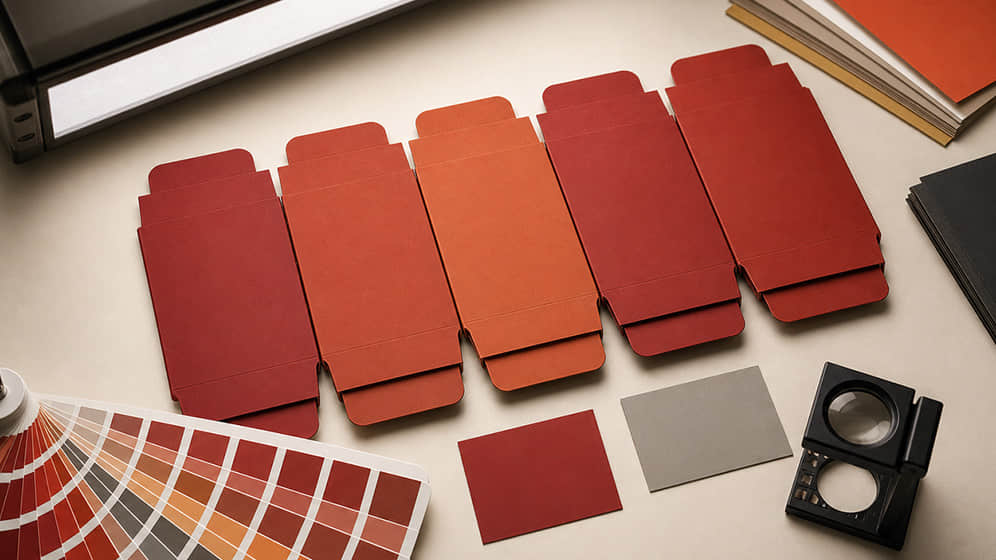
A colour may look perfect on a laptop screen, slightly different on a printed sample and different again when applied to textured paper or covered with a matt film.
This does not necessarily mean something has gone wrong. Digital screens and printed packaging create colour in fundamentally different ways, while paper, ink, coatings and lighting all influence the final appearance.
Professional colour control cannot remove every natural production variation. What it can do is establish clear standards, identify the most important variables and keep differences within an agreed and commercially acceptable range.
Screens and printed packaging use different colour systems
Computer and mobile screens display colour using RGB light: red, green and blue. Printing normally uses CMYK inks: cyan, magenta, yellow and black.
RGB displays can reproduce some bright colours that standard CMYK printing cannot match exactly. A luminous green or vivid blue on screen may appear more subdued when printed.
For this reason, an attractive screen image should not be treated as a reliable production colour reference. Artwork should be prepared in the correct colour mode, and critical colours should be discussed before printing begins.
CMYK and Pantone serve different purposes
CMYK creates colours by combining four process inks. It is suitable for photographs, illustrations, gradients and artwork containing many colours.
Pantone colours are individually specified references. They are often used when a brand requires a more controlled solid colour, particularly for a logo or large background area.
Pantone printing does not make colour variation impossible. The result can still be affected by paper, ink density, surface coating and drying conditions. However, it gives the production team a clearer target than selecting a colour by eye from a screen.
A project may use:
CMYK only;
one or more Pantone colours;
CMYK with an additional Pantone colour;
Pantone colours combined with foil or other finishes.
The best approach depends on the artwork, required consistency, order quantity and budget.
Paper colour changes the printed result
Ink is not completely independent of the material beneath it.
A bright white coated paper reflects colour differently from warm white, cream, grey, brown kraft paper or coloured specialty paper. Uncoated papers also absorb more ink, which can make colours appear softer or darker.
On a coloured sheet, the paper becomes part of the visual result. A pale printed colour may lose brightness, while certain colours may shift noticeably.
If colour accuracy is important, the sample should be produced on the intended paper or on a material with very similar characteristics.
A colour approved on one paper should not automatically be expected to look identical on another.
Coated and uncoated papers behave differently
Coated paper has a smoother, less absorbent surface. It normally supports sharper details and more vibrant colour reproduction.
Uncoated paper allows more ink to enter the fibres. The result may feel natural and tactile, but fine details can appear softer and colours may be less saturated.
Neither result is inherently better. It depends on the intended brand character.
A natural food or tea brand may prefer the warmth of uncoated paper. A colourful retail carton may benefit from the clarity of a coated sheet. The print design should be developed with that material behaviour in mind.
Lamination and varnish can alter colour
Surface finishes do more than protect packaging.
Gloss lamination generally increases contrast and makes colours appear stronger. Matt lamination can create a quieter, more refined surface, but it may make colours look slightly deeper or less vivid. Soft-touch and anti-scratch films can produce their own visual effects.
Varnishes and UV coatings also affect the way light reflects from the surface.
This means colour should ideally be approved after the intended finish has been applied. Judging an unfinished printed sheet may not accurately represent the final box.
Dark colours require careful control
Large areas of black, navy, deep green, burgundy or red can create impressive packaging, but they also make certain production issues more visible.
These may include:
uneven ink density;
dust or small surface marks;
scratches caused by handling;
colour variation between printed sheets;
cracking along folded edges;
fingerprints on some matt surfaces.
The artwork, material and protective finish should be reviewed together. In some cases, an anti-scratch film or protective sheet between boxes may be appropriate. In others, slightly adjusting the colour construction can improve stability.
A dark design is not necessarily difficult, but it should be planned rather than treated like any other print job.
Lighting changes how colour is perceived
The same box may look different under daylight, warm hotel lighting, cool office lights and retail spotlights.
This is why colour should be assessed under a consistent viewing condition. If one person approves a sample beside a window and another checks production under a warm lamp, their judgements may differ even when they are looking at the same object.
For critical brand colours, it is helpful to agree on:
the physical reference being used;
the type of lighting used for comparison;
which area of the packaging is most important;
the acceptable level of visual variation.
Clear conditions make colour discussions more objective.
Digital samples and production printing are not identical
Digital sampling is quick and useful for reviewing layout, text, approximate colour and the overall appearance of a box.
However, digital equipment may use different inks and colour behaviour from the offset press used for mass production. Special colours, metallic inks and certain finishes may also be simulated rather than produced in the final way.
A digital sample is therefore excellent for some decisions, but less suitable for approving extremely sensitive colour.
When exact colour is commercially important, a press proof or an agreed physical colour reference may be needed.
Signed samples create a shared standard
Once the colour, material and finish have been approved, the confirmed sample should be retained as a production reference.
This is sometimes called a signed sample, approved sample or golden sample.
It provides a shared basis for:
The reference should represent the complete approved construction wherever possible—not simply a digital printout or a colour viewed on screen.
Repeat orders can still show small differences
Paper and ink are manufactured in batches. Humidity, temperature, equipment and production conditions also change over time.
As a result, two production runs made months apart may not be mathematically identical. Professional colour management aims to keep them visually consistent within an agreed standard.
For repeat orders, it helps to retain:
The more precisely the original standard is recorded, the easier it is to reproduce.
Good colour management begins before printing
Colour consistency is not created by one machine setting at the end of production. It begins with the artwork and continues through material selection, sampling, printing, finishing and inspection.
For colour-sensitive packaging, confirm:
whether the artwork uses CMYK or Pantone colours;
the exact paper or covering material;
the intended lamination or coating;
the type of sample being approved;
the physical reference for production;
the lighting conditions used for comparison;
the agreed tolerance for natural variation.
This creates realistic expectations and gives the production team a clear target.
Have a packaging project with an important brand colour? Send us the artwork, Pantone reference and preferred material. We can assess the likely print result and recommend an appropriate sampling process before mass production.