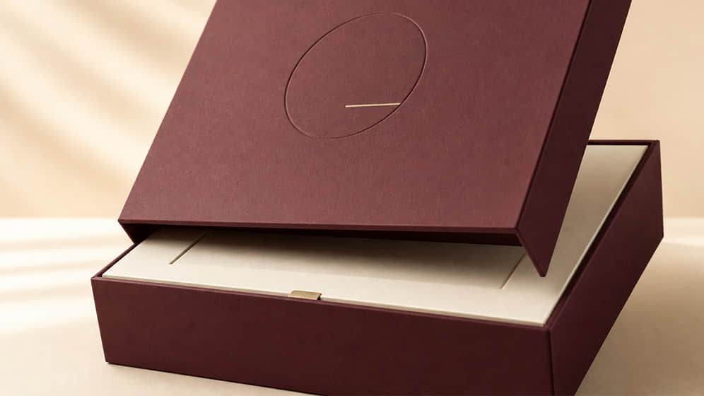
When brands begin developing premium packaging, it is tempting to make a list of decorative effects: foil stamping, embossing, spot UV, textured paper, ribbons, magnets and perhaps a printed insert as well.
Each process can be effective. The difficulty begins when too many of them compete for attention.
Premium packaging is not defined by how much decoration is added. It comes from the way structure, material, colour and finishing work together. In many successful designs, the result feels considered precisely because the designer knew what to leave out.
Start with proportion
Before choosing paper or foil, look at the proportions of the box.
A few millimetres can change how refined a package feels. An oversized box may appear impressive in a rendering, but it can feel wasteful when the product is opened. A box that is too tight can be awkward to use and difficult to manufacture consistently.
The relationship between the lid, base, product and insert should feel deliberate.
For example:
a shallow lid can create a light, contemporary appearance;
a deeper lid may feel more formal and substantial;
a narrow border around the product can look precise;
excessive empty space may make the product appear less valuable;
an insert that sits slightly below the box edge can create a more controlled reveal.
Good proportion is quiet. Customers may not consciously notice it, but they will notice when it is wrong.
Choose materials for touch as well as appearance
Packaging is experienced by hand, not only by sight.
The covering paper on a rigid box may feel smooth, fibrous, soft, dry or lightly textured. These qualities influence the customer’s impression before the box is even opened.
A heavily textured paper can add character, but it may reduce the sharpness of fine printing. A soft-touch surface can feel pleasant, but certain finishes show fingerprints or scuff marks more easily. An uncoated paper may feel natural and sophisticated, while also absorbing colour differently from a coated sheet.
Material selection should therefore consider:
the desired brand character;
print performance;
resistance to handling;
compatibility with foil or embossing;
storage and transport conditions;
the customer’s expectations of the product.
A paper that looks beautiful in a sample book is not automatically the best paper for every production process.
Make the opening experience feel controlled
The way a package opens can communicate quality more effectively than decoration.
A drawer box should slide smoothly without falling open. A magnetic lid should close securely without requiring excessive force. A two-piece rigid box should provide enough resistance to feel substantial, while still being comfortable to open.
This experience depends on manufacturing details such as:
board thickness;
clearance between components;
covering-paper thickness;
magnet position and strength;
insert height;
dimensional tolerances.
If the fit is too loose, the box may feel cheap. If it is too tight, customers may struggle to open it and the covering paper may wear at the edges.
This is why a physical structural sample is so important. Opening behaviour cannot be judged accurately from a visual rendering alone.
Use one clear focal point
Premium packaging usually benefits from a strong visual hierarchy.
The focal point may be:
a restrained foil-stamped logo;
a deeply embossed pattern;
a contrasting sleeve;
a carefully positioned illustration;
a distinctive opening detail;
a single area of textured paper.
Once the focal point has been chosen, other elements should support it.
For instance, combining large metallic areas, spot UV, embossing and several colours may cause every feature to compete. Using a single foil colour on an uncoated paper may deliver a more confident result.
A useful question is: what should the customer notice first?
If the answer is unclear, the design may need simplifying.
Foil should support the design—not rescue it
Foil stamping is strongly associated with premium packaging, but it needs to be used with care.
Large foil areas can reveal surface variation and make accurate transfer more difficult. Extremely fine lines or very small lettering may not reproduce cleanly. The foil also needs to be compatible with the paper, ink and any surface coating beneath it.
Before production, check:
minimum line and gap sizes;
whether the design contains fine reversed details;
the contrast between the foil and background;
foil adhesion to the selected surface;
alignment with printed or embossed elements.
Foil is most effective when it highlights something important. It cannot compensate for poor typography, weak proportion or unsuitable materials.
Colour consistency matters more than colour quantity
A limited palette often feels more refined than a crowded one.
However, simple colour schemes can be demanding to manufacture. A large area of dark green, black, navy or red makes colour variation, dust and scratches more visible. Light colours may also shift depending on the paper beneath them.
If a brand colour is important, the production team should agree on a physical colour reference. This may be a signed sample, an approved printed sheet or a Pantone target interpreted for the selected material.
The aim is not to pretend that all production variation can be eliminated. It is to establish a practical standard against which the finished packaging can be judged.
Pay attention to edges, corners and alignment
Customers often recognise quality through details they cannot name.
On a rigid box, this includes:
clean wrapped corners;
straight edges;
consistent joints;
centred lids;
accurate foil positioning;
smooth surfaces without trapped air;
inserts that fit neatly against the box walls.
These details depend on structural design, material behaviour, machine setup and skilled assembly. Decorative artwork may attract attention, but consistency in construction is what sustains the premium impression.
Design for the whole product experience
The outer box is only one part of the presentation.
Consider what the customer sees after lifting the lid. Is the product immediately visible? Is there a card or message covering it? Can each item be removed comfortably? Does the insert stay tidy after one item has been taken out?
A premium opening experience should feel intuitive. Customers should not need to pull hard, turn the box upside down or damage the insert to reach the product.
At the same time, every layer should have a purpose. Unnecessary trays, wraps and decorative components increase cost, assembly time and waste.
Premium packaging is a matter of judgement
There is no single material or finish that makes a box premium.
The result comes from a series of balanced decisions:
appropriate dimensions;
carefully chosen materials;
controlled opening behaviour;
clear visual hierarchy;
one or two well-executed finishes;
accurate production;
an intuitive product presentation.
The objective is not to make the packaging look expensive for its own sake. It is to create an experience that feels appropriate to the product and convincing to the customer.
Developing premium gift packaging? Share your product, target market and visual references with our team. We can help you select a structure, material and finishing combination that looks considered without becoming unnecessarily complicated.